
Showing posts with label OUIL 505. Show all posts
Showing posts with label OUIL 505. Show all posts
Tuesday, 9 May 2017

Monday, 8 May 2017
Applications
With all the work done, I have to make suitable applications for the comic, starting with my main chosen platform, a mobile/ tablet mock up. This is the most exciting application for me, meaning that anybody with a smartphone could view the comic, from anywhere, no need to visit a shop. Its a crazy world we live in kiddies.

Outside of this there is also a physical version, I voiced concerns about the format possibly looking goofy in the final application, but luckily I feel it looks fine. Thanks to the weird shape of the product, I did have to make a physical version of it, which is possibly for the best, showcasing that it works this way.


Outside of this, I have a pretty standard collection of applications, having some prints, but mainly having apparel. I used both the death and poster designs, having images that possibly works for differing age ranges.

These choices were made based on an existing comic dealing with emotional themes, the sad ghosts club:

being honest, Im not overly fond of this brand, they make really basic observations on the subject of sadness, then make products with simple designs and vague related text. That being said, I see similarities in the following they have gained and the target audience of my comic, seeing them as a suitable blueprint for my applications.
One final application, focuses more on a web presence than something to sell, a little animated advertisement.


Something simple that would give a little info on the comic, and link to where you can read it. Below is an example of a possible layout/ use of the ad.

Speaking of an animated ad, within my proposal I will suggest that a final version of the comic would have animated panels, I feel that would draw more of an audience.
Poster design
I can breathe a sigh of relief, the comic is finished, I have a finished outcome, with what I believe counts for six illustrations (eight pages and a cover). Yet I still feel the need to make something that can go on products and marketing. There is the previous death draught, but feel that is inappropriate towards a younger audience. I didn't expect this, but the finished comic does seem to be something older kids can read, leading to this step in the process.
Keeping a younger age in mind, the father and son, and their relationship feels like the right angle to take on this one, having them playing around, hanging out for lack of a better term.

That comment I made earlier about needing to know how watercolour works to properly replicate it kind of shines through on this image, it isn't convincing at all. I kind of got away with it on the smaller panels of the comic, but doing what should be a full, detailed image really showcases my lack of experience with the medium. Lesson learned, learn to paint doofus.
Comic cover
Having completed the comic, I still didn't have a cover to use, and wasn't too sure how to go about the design for this comic.

I wanted to allude to the themes of the comic, but not give any of the plot away. It became pretty apparent that just showing death was the wrong choice, despite it being a recognisable image that could draw an audience. I have to keep the integrity of the comic in mind in this case, using something that might not exactly draw a crowd, but at least doesnt give away the story.


I found a close up of deaths cape was the right choice. For the text, I found a blockier font to be more appropriate from my selection of tests. My instinct was to go to red on the backdrop, but that didnt feel right for the comic. I decided that, because the colour features heavily in the comic, a murky blue was the right choice.


From that, I simply had to change positioning for the composition. The text didn't sit right for me just having it over the image. For this I added a dark inner glow, to suggest the text is set within the image. Finally as a further reflection of the death design on the cover, I gave the text a gold leaf texture, resembling the bones of death.
Panneling


Having now completed a page for the comic, I was a little lost as to how I should panel it, coming to the conclusion that allowing the edges of them to remain was the way to go. I feel it sells the illusion of "watercolour" medium more.
Brief medium tests
I had full intention to do two full example scenes of the aerial view on the house, starting with the actual watercolour version of the scene, then also a digital equivalent.

Starting with the actual watercolours, I applied the basic flat colours, and then had to wait for them to dry before getting detail in there. I thought I should get the flat colours of the digital version down while I waited.. and I just kept going. It became apparent very quickly what I would use for the comic. There are a lot of panels to create for this comic, and I simply don't have the time to wait for them to dry every so often.

Im also really quite satisfied with how the brushes capture a watercolour effect. I feel like my lack of experience with the medium shows through the image, as not really having an instinct as to the way the medium looks naturally , means I cant exactly replicate it. Im still more than happy to continue like this though, just something to take in to consideration in the future when making a illustration that hopes to look like watercolour.
New design: The mother


Just to end the early design stages, I felt the need to give the mother who appears at the end some attention. The character design to me seemed quite obviously a spur of the moment design, and decided to tailor her like the son and father.
Comic response + progress tutorial
I was really concerned about showing the comic to others in the class, It's really quite a personal thing and felt that I may have executed it in a lacklustre way. I was really surprised by just how positive the feedback I got was, with one person finding it necessary to say "James has a heart". I take this to mean that the emotional themes reached them, rather than my class mates just seeing me as a bit of a bastard, i can live in hope anyway.
Regardless this is quite promising not only for this project, but for my aspirations as a story teller in general, maybe I do have it in me to reach an audience.
On top of this I had a decent tutorial, But Im not quite sure the group grasped that I plan to make painterly looking, with the group saying that the comic wasn't enough for the outcome. Id be inclined to disagree, But I guess the outcome should display this. There was a suggestion from the tutor that I make multiple illustrations alongside the comic which I feel is a little harsh, the project is going to take quite a bit of effort as it is. If never really came out of a tutorial conflicted like this, is it arrogant of me to decide that the suggestions were possibly not the right direction? Regardless, Im sticking with my gut and making the comic, creating this outcome is kind of top priority in this project for me.
First draught of the comic
Finally having the designs sorted, I felt I could now make a digital draught version of the comic, readable as to gain some impressions from my classmates. This was a pretty simple process, needing only to use scans of the pages, making some rough digital lines over them, and finally adding the text. Resulting in this:
Finally creating the boy

I took a slight break from planning panels, to work on the designs of the boy, still didn't like it, so made more of the comic draught.


From this I finally came to a conclusion on how the boy should look, finding that enlarging the features helped greatly.
Further pages of the comic


I probably should have worked on the boy, but just didn't want to, opting to draught more of the comic, creating around three quarters of the overall comic here. Im surprised with how happy I am at this point considering it normally takes two or three versions of a comic draught before I find I have something suitable for use. This time I feel comfortable with the idea of using the layouts I have.
DEATH
Yet another design to create for the comic, but for this one I have a strong foundation, using Stacey Rozich's designs as reference.

I started being really playful with the shapes building the character and the tone. There isn't anything saying death has to follow certain perimeters in terms of build, meaning I explored all shapes and sizes. I even experimented with the tone, having goofier, more caricature designs in the mix. I decided on a sort of respectful design, lacking any extreme modifications to the form. Having too goofy a character would kill the tone of the comic in general.


Here are fleshed out versions of the design, with a scaling guide as I start to consider the height of the characters. The only real alteration to the death design is the cloth over the eyes, and golden bones. The cloth is there to represent a sort of blindness to the situation. Regardless of the fact that a young boy will be losing his father, death has a job to do and is unaffected by the sadness of the situation. The gold, inspired by Rozich, is also a signifier of the importance given to death in our western culture. We worry so much about it, giving it such importance, whereas in other cultures it is seen as a time to celebrate the persons life. I felt a need to somehow portray our approach to the situation through this.

I see some potential in this design, I feel I may use it on some products in the later stage of the project.
Further character development


Im really struggling to create a design that I like for this boy, which is quite frustrating considering how quick I was to create the fathers design. I do feel Im getting closer, but know that Im not there just yet.


Out of frustration, I opted to work on the rest of the dad, now knowing that the story begins with him returning home from work. This meant that he would most likely be wearing smart attire, and trying to convey the idea of him being a neat man, It is all well maintained (tucked in shirt, tight tie etc..). Another experience of feeling satisfied with the design relatively quick.
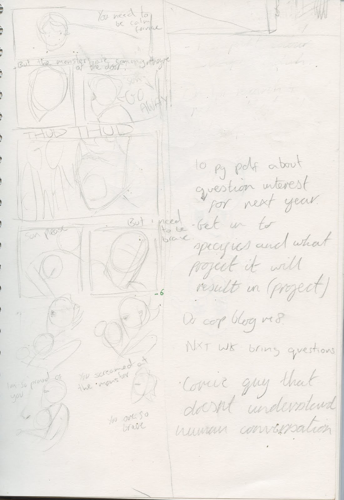
Plotting out the plot


I fancied just diving in with the narrative of the comic, It was frustrating me that I didn't have an actual story to work with, so made a few thumbnails and lists of the specific events, following the themes laid out in my comic plot post. I also fancied a crack at a death design, coming to the conclusion that a physical manifestation will appear within the comic. Major Stacey Rozich influence for this one, feeling a golden death.

This continued in to a draught of the first page, but I was clearly too eager to jump ahead, considering I was yet to finalise the childs design.
I decided, thanks to Carrolls comics, that I will be using a digital distribution method as my focus. This is why the page takes form in long thin strips, to fit the mobile screen. Im very interested to see how working in this style may effect the project as a whole, especially considering there may be printed versions produced, Will this still look ok? Only time will tell I guess.
Creating the central characters


I started with the boy, struggling to make him look as young as I intended, I want him to look around the age of 7, but find myself overshooting it just a little.

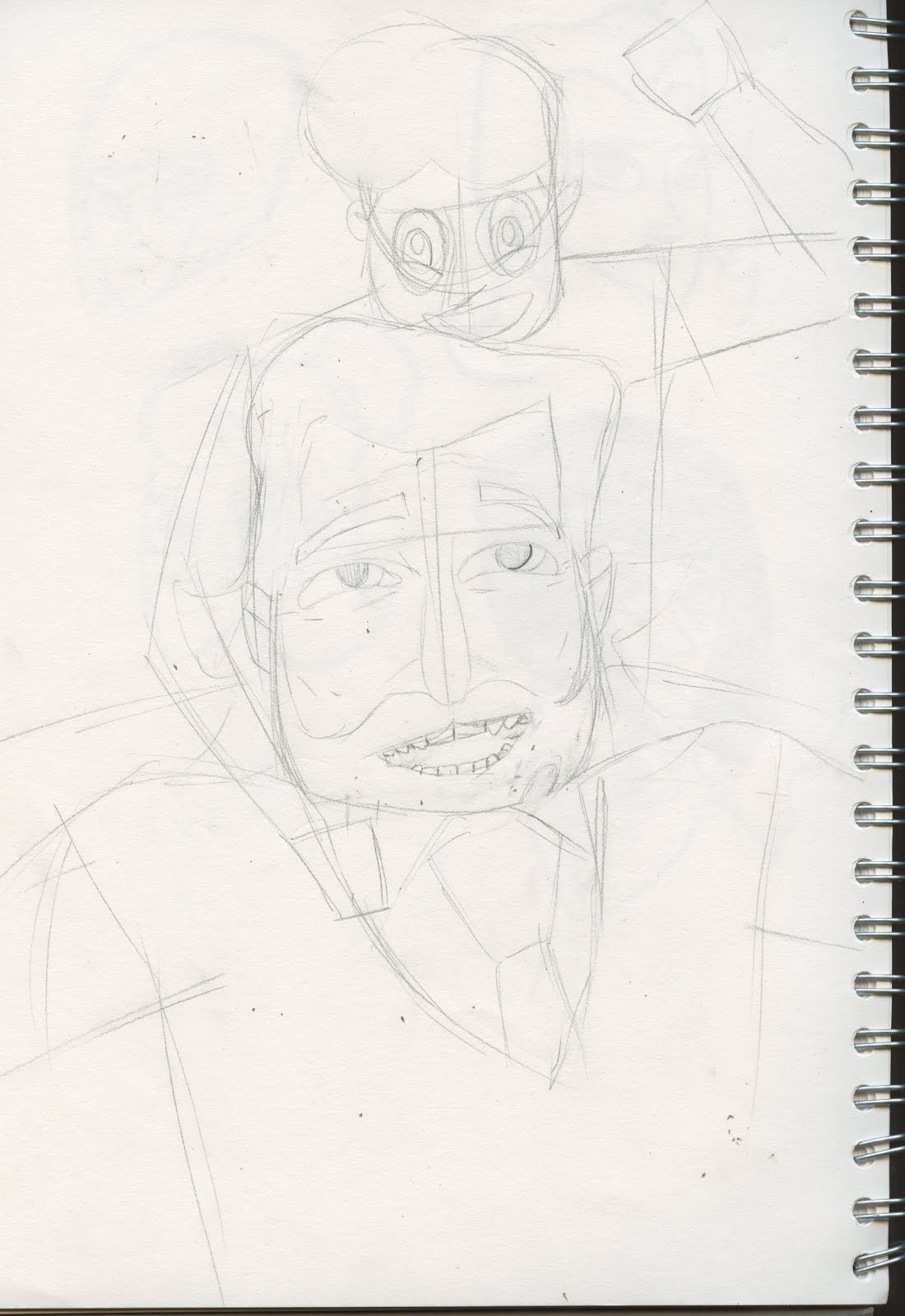
I then thought I should create the Father, with an aim of a knowledgeable, kindly figure. The first designs really missed the mark, looking scruffy and homeless, finally resulting in a clean cut design of a man that seems to have his s**t together. I just had to hone in on the likeable aspects, such as cheerful eyes, wrinkles that show a person that has smiled a lot, and just clean cut demeanour.
I tried to apply this design to the child, making him look like the dad in some ways. This just didn't work, with him just looking too old again.
The Comic plot
So I feel I need to make something that doesn't go far over a page count of six, having that amount of pages will take up the amount of illustrations required for the project. I feel this may be too little for the comic, so I guess I'll see how it goes on this front. The story itself will focus on the characters of father and son, building their relationship before the fathers sudden death, conveying a message of leaving without saying what needs to be said, in this case the father stating his pride in his son.
Im more than certain I want the create softer artwork thematically for this project, with Junji Ito's style going out the window, I want a heartfelt, honest outcome for this project.
Subscribe to:
Posts (Atom)