
Showing posts with label OUIL 504. Show all posts
Showing posts with label OUIL 504. Show all posts
Tuesday, 17 January 2017


Final crit.. kinda
So now that everything has pretty much been said and done with the project, we had a final crit, and bloody slept in, the one day to do so.... I thankfully got to the tail end of it, seeing all the stings that were brought up on the projector, and able to see everybody's work laid out, everybody has done such a great job, It really was lovely to see. I also managed to pull a few people together for a mini crit, and got some great feedback, especially when people would pull faces at the gross faces within the book. The sting seems to have gone down well, being given big grins once they watched it.
Presentation
The outcomes are finished! Its time to start thinking about how to package them.


In order to separate the elements of the unit, I used a little sticker that I made, something that used my "signature/logo" and also was in keeping thematically with the outcomes and work of the unit. Its a really simple little addition, but the labels do really make navigating the work much easier. It also benefits the collection by making things look that bit more professional, even if it is just a bit of newsprint made in to a little folder.


I think my final presentation of both physical outcomes have worked in their favour, especially the book, having packaging like that actually makes the outcome seem more commercially viable, I feel like I could totally sell copies of this now.

I updated a couple things with my editorial also, alongside the addition of the fake newspaper set up, I did a little touch up on the horse image. This is one that was noted as being the weakest of my editorial set, the main reason stated was that the horse didin't quite have the render quality of the rest of the images. So at the end of the project and having some time, it was only right to address the issue.
Final Animation, Here comes the flattie!
I fucken did it! I want to enter a yearlong coma, but I finished the damn thing!
So how do I feel about it? Honestly, quite proud, I put time and effort in to the production of this animation, and I feel this really shows. Despite this, there are clear issues and errors within the video, I feel it is quite apparent that I only have a small amount of experience with both after effects and animation, shown through a lot of inconsistencies. The timing of the video seems very rushed, as I tried to squash as much content in to the video as I possibly could. This is a lesson learnt, spend more time with the animatic, it's a great way to get to grips with timing if I allowed it to, definitely took it for granted, changing the animation after producing it. The animation also seems a little strange sometimes, as there are sections that use more frames, giving smoother motions, and sections that use fewer frames, and It really shows when pared with the other sections.
Opposition pt 2

I really tried to use as little an amount of frames as I possibly could this time, saving up a load of time, and the animation doesn't really seem to be that poorly affected by it, this especially shows when you concentrate on the little orwell, three drawings, thats all I did for him. I had a little re cap on the principles of animation, and found anticipation, this is when you use movement to allude to an up coming action, i.e. the flattie compacting in, before reaching for Orwell. I feel that finding out about that really strengthened the quality of this section of animation.
Opposition pt 1
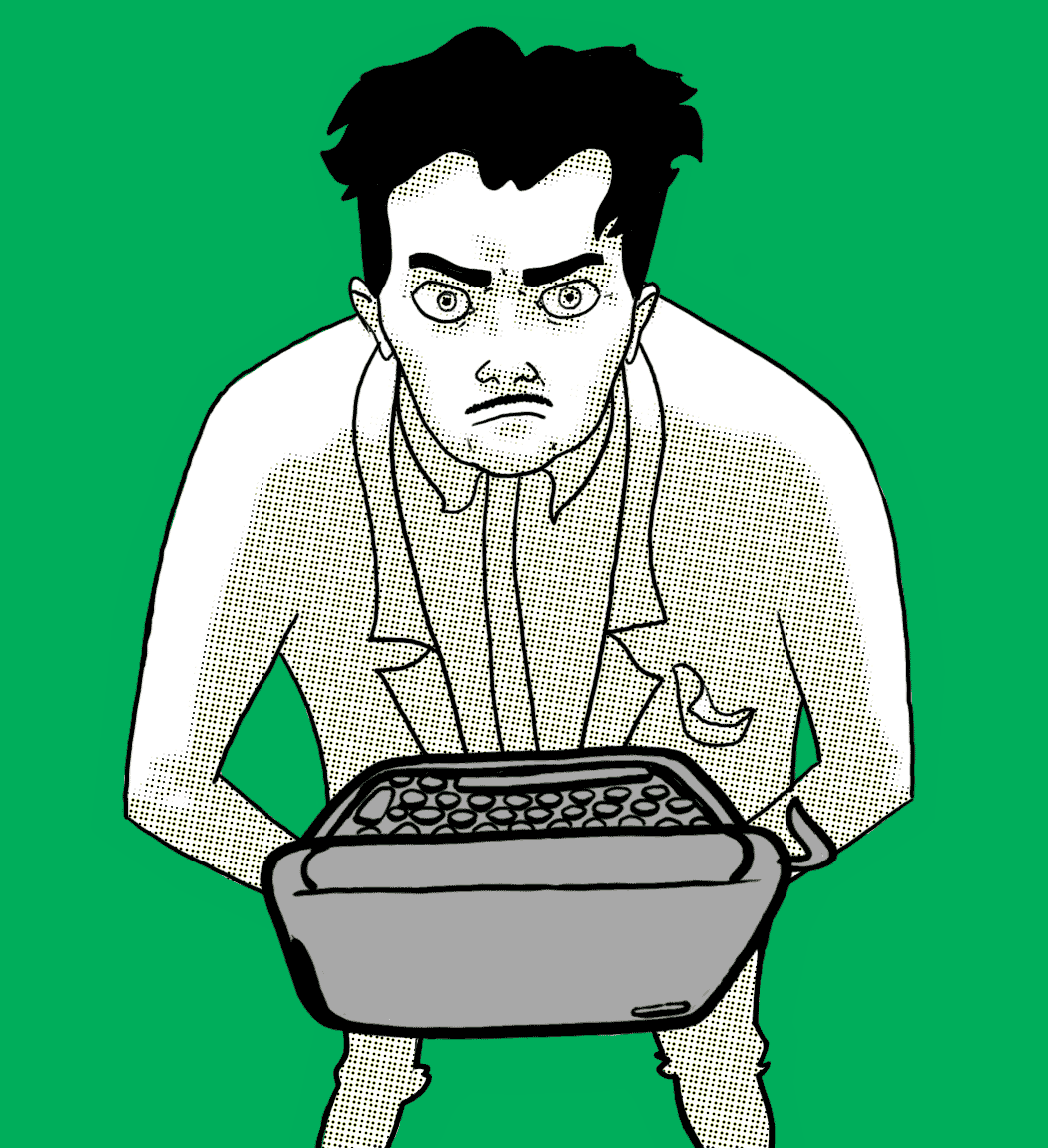
Back at it and I've paced out the frames, he is now giving the occasional death glare, defiant till the end. Also I stopped the typewriter movement, so the animation is back to being suitable for kids. I forgot to mention that the background is green for a reason, its to act as a green screen, meaning that if I make the animation a gif from photoshop using the timeline feature, I can just edit the space out. Streamlining!

This feels much petter as an animation, everything is moving seamlessly and simultaneously, a much better standard of animation here.

I really wanted a cheesy sort of versus screen to use these two animations in, having a line splitting the screen in half, and half of each animation on the screen at the same time. And thank god for after effects, totally was possible to make thanks to the programme. This also marks a bit of a turning point in the soundtrack, speeding up, becoming more aggressive as the two prepare to face off.
Orwell in love
The fight is on between the flattie and orwell, Its time for things to heat up in the animation. Im going to give an aerial view of orwell, trying to give off that he is smaller in scale than the now gigantic paper flattie. This is when things get good, so much more effort will be given to the animation, going for a frame by frame again.
My main worry when animating orwell like this, was that I wouldnt be able to make him stylistically match the pan of the intro. Thankfully, using the pixel halftone pattern on photoshop is a doddle, meaning I only needed to colour in the shaded sections and flip the metaphorical switch.

Orwell loves his typewriter... a little too much here. My attempts to have it lift with his body here totally make it look like he is humping it, super goofy. It also suffers from the opposite problem that the getting up animation had. There are too many frames, this happens too smoothly, too fast. I need to pace out the frames a little, and not have the damned typewriter move.
Musical timing

As stated with the sound task, and the gorillaz video, I said that I would "borrow" one of the movements, and animate it to the beat of the music. It worked out fine, but things felt a little static when just leaving the images as were. For this I applied a TV static filter, that caused the images to wobble a bit, making the scene that more interesting, and because the movement is unnatural, adds a bit of creepiness to the flattie. I tried to achieve the dimensionality addressed in my Beatles write up task, I feel that I kind of pull it off, but sadly not in a way thats visible enough to effect and improve the section. Still, Its something that I can try to improve upon in future tasks.
Crit

Here is my feedback sheet for the ending of the book brief, and beginning of the animation, just before breaking up for christmas. Lots of really interesting stuff, a big note being the belief that my strongest images are the ones that utilise simple shapes, Id be inclined to agree, ip to this point, Ive always avoided shape driven work, not particularly being fond of that style, but I feel I've found a middle ground that works for me. Lots of nice comments about the sting and its track also, drives me to work hard on it, to make the best outcome I can.
Start of frame by frame elements
Time to put some real effort in to this piece, I'll start with what I will assume to be the easiest part, animating Orwell getting up from the ground as the Flattie paces towards him.

I thought Id throw in a version of the animation with all the various stages of the animations preparation. From loose line work, to not so loose, to the final filled in shapes. This will generally be my process for making these types of animation, just so I don't need to show screenshots of each stage, when I animate in this way.

Here we have it, I made the shapes in photoshop, which will then be thrown together in after effects, which makes the animation. I think this image shows just how out of practice I am, the timing and positioning is off all over the place with it. I could go through the process of re animating the section, but, this will be a small element, and there probably is a way to mess with timing on after effects. If I leave it to that, Its an excuse to get to know the programme a little better, so Im going to rely on that.
Frustrations
Man, sometimes I just hate this thing, I mean, why do things that should work so clearly in my head just not in this. I mean look at this, look how goofy.

I gotta stay calm, I'm new to the programme and expecting miracles, Ill take a little break from this for now and come back with a better solution. I also got to keep in mind that there is also frame by frame animation if Im really unhappy with how a section is moving. Lessons learnt from the delta music video, mix both types of animation.
Making components
Much like the shapes for the animatic, these images will be thrown about using after effects, I just have to be more considerate about their movements now for the final product, like the movements in the unsatisfying series.


These three pretty much encapsulate the type of imagery I will be using. Firstly theres Orwell from his sleeping pan at the start. For the animation Im going to give him the halftone pattern this time, If I was to gave him the old hobo crosshatching, I would have resorted to jumping out a window with all the effort, especially in the real animation heavy sections.


This time the flattie has the printed look. I used the above lino prints for reference, including rough lines within the face, like sections that have remained raised in a lino cut. The reason I went to this length, of creating the lines digitally, is again because I simply wouldnt have the time to cut and print all the separate frames. Same issue new window.
Finally theres the text, made to mimic the cover text of the book. I think this may be the only use of the text in the sting, but anything could happen, I may switch things up.

In order to achieve the texture of the flatties filled in section though, I used the rolled house image from the lino print induction. It proved to be the far more interesting of all my print textures. It just needed a little switch up in colour. I've decided to go for red because, I kind of feel like it links it back to the original editorials. Thematically, the animation is the book all over, so I thought it would be nice to bring all the elements of this unit together, full circle sort of.
The only thing that hasn't been covered here is the music, but rest assured that Is sorted, just put a little guitar melody, whistle and garage band drum beat together and I'm sorted. We'll have a look at that when we get to the video itself.
Further storyboarding = character development.
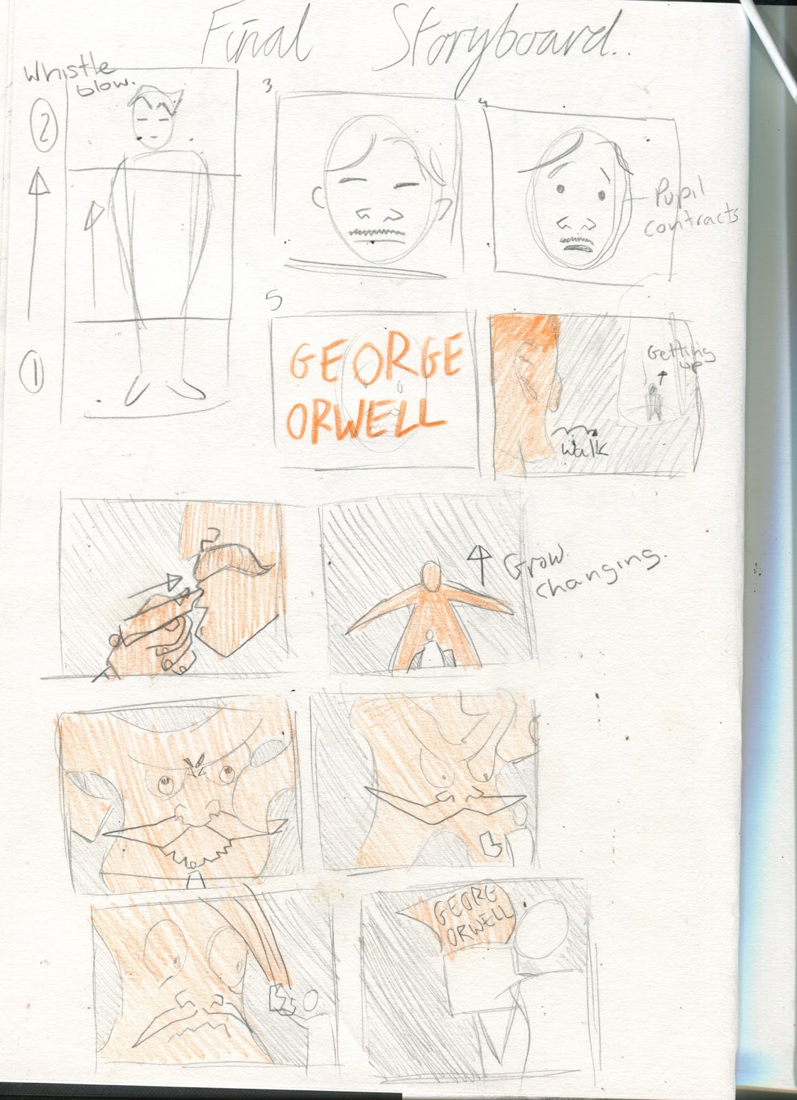
Anamatic done, and it looks ok, more importantly, the animation looks doable. If I commit to this, i know I can make something to be proud of. I do have one issue though, and its still the ending, so I made another storyboard, a final one this time, one where the flattie doesnt duplicate, but chances in to one big paper mass.m He then reaches to attack Orwell, who catches him in a typewriter. Once he shrinks in to it, writing is revealed on the typewriter, meaning that the flattie is actually one of his creations, the idea of authority that he wrote about/ against.
Anamatic
The ball is well and truly rolling, even though this is only early stages, It's really nice to see some motion to my work. At this stage Its quite nice to have such simple methods of moving objects, but no doubt I will use some harder frame by frame type stuff later on. What this clip is really missing Is some audio, I suspect things will really fall in to place when I have a soundtrack to dictate the flow of the video. Which also reminds me that I should do some audio based research.
Flattie Storyboards Sketchbook

This is going to be the storyboard that I concentrate on for now, although there is an aspect that I feel can be done better. It is based on the diary entry where orwell is asleep, when one of the hobo's scream out here comes the flattie, whilst the police approaches. It starts with a pan of orwell sleeping and is awakened by the shout. The Flattie gets closer, and transforms in to a cloth/ paper, envelop/ incarcerating orwell, who then wakes up from the experience, which was a bad dream. The ending is super been there done that, so Im pretty sure I will change that...
Musical task
(Again, click the main image to be taken to the video)
Gorillaz clint eastwood

It's a really satisfying video, and I think I know why. I feel that It is because the animators put as much effort in to syncing movement to music as they could. From the below monkeys dancing to the song to the ghost erecting to the beats of the cymbals, everything is so well timed, I could endlessly talk about the sections that do this.

Im for sure going to steal the ghost coming out of the body movement. As you can see in the animatic, I will have a section were the flattie grows, stretching out to a paper thin consistency. Rather than just have the slow growth. I will split it in to different sections, using multiple still poses between drum beats. This will make for a much more interesting section. Thanks Gorillaz!
Beijing olympics: Monkey journey to the west spot

This was made by the same studios as the clint eastwood music video, its interesting to see how their work changed after a few years, and how they respond differently making an advert this time. The music this time varies quite often, introducing new elements, and the animation alongside it does the same thing. If you look out for these kinds of things, you can tell theres a tonal switch simultaneously between both music and animation, things like the music becoming more triumphant when the last of the main team is introduced. The video also features more satisfying movements to the beat of the music, with the ground dragon things snapping their mouths shut to the drums, it's so satisfying, and something I never paid mind to watching the clip previously.
Beatles rockband intro

Now this may look like its also a Jamie Hewlett production, but this was made by Robert Valley, he liked Hewletts work a lot in his formative years of illustration... Regardless, theres something that really interests me, and thats how the video is layered. Every object or character is clearly 2D, but I assume thanks to a keen eye and understanding of After effects camera work, theres a great deal of depth to the scenes, Its really an interesting trick, adding extra polish when dictating a foreground and background so clearly. Sound wise, what a cracker, really playing off the history of the beatles, switching the design up when switching songs.
This task has inspired me to think of one thing prominently, how I can find a way to have the music change with the video, if Orwell is being wrapped up, make the music creepier etc. On top of that, play with the beat of the music! It makes for a really satisfying watch when the sound dictates the movement.
Subscribe to:
Posts (Atom)