Showing posts with label OUIL 406. Show all posts

Thursday, 21 April 2016

OUIL 406 summary

1. What have you learned about visual communication during this module and how effectively do you think you have applied these ideas?

  • It is crucial that i continue to explore medium, my work looks all the better for it, and keeps things exciting to look at than just flat colours. I understand the process of stripping an image down to its basic elements (semiotics), but have become even more so aware that the process doesn't fit what i strive for in illustration. Even in saying that, i have gained said knowledge and will be able to apply it when i return to such subject matter.And will help when i'm building a detailed image, using a stripped down version to inform my composition.

2. What approaches to/methods of image making have you developed and how have they informed your concept development process?
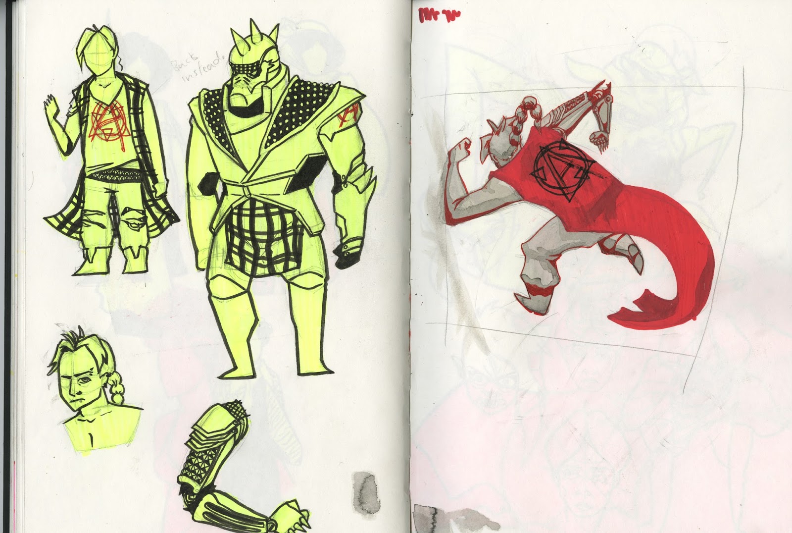
  • As previously stated, i need to keep exploring and playing with medium , thanks to this project i've started to incorporate both more of a range when making concepts, and also not being afraid to implement them in my outcomes. I have also learnt new ways of working, getting to grips with illustrator and using a shape driven process. And not forgetting animation, its a process that i dislike doing but love the outcome, quite the opposite of my vector experience, but its something i need to consistently return to, it'll only improve my craft and widen my portfolio.
3. What strengths can you identify in your work and how have/will you capitalise on these?
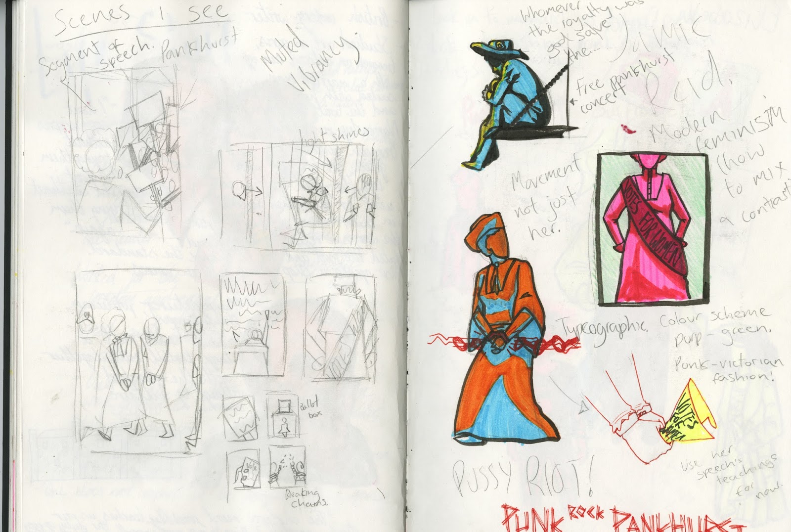
  • Exploration of materials is my big take away, my way forward is to add to the load and practice their implementation, tightening the overall outcome ensuring that i don't just get lost in a free for all of materials in my work that looks messy, i almost had that issue with my final poster, but my peers kept me grounded and i need to keep that in mind. A big deal for me in this project has also been my use of colour, i am quite proud of my choices, especially seen as i didn't use colour reference and created it all of my own accord, i need to consider more than vibrant and contrasting tones from here on out, thinking of tones that sit happily next to each other.
4. What weaknesses can you identify in your work and how will you address these in the future?
  • I am quite the pig headed fellow, i feel i'm just hard wired to dislike shape based imagery, i really want to like it, and be able to use it. Maybe this is the problem, i'm trying to force an interest, making things worse, or possibly i should just come to terms with the fact that it just isn't for me, and not let my disinterest annoy me the way that it does. Also, i need to just stop running away with ideas, i really need to stop and consider the effectiveness of what i'm creating, i get caught up in muddled ideas that are in dire need of streamlining. And i need to loosen my own practice, try not to get caught up in what is a "James Moore" drawing, resulting in everything looking cookie cutter.
5. Identify five things that you will do differently next time and what do you expect to gain from doing these?
  1. Switch things up style wise, even if its the slightest difference, i don't want to restrict myself here because i've decided i only use one shape of eye. Ill have a healthy range and more interesting imagery.
  2. I think i fancy making things at a bigger scale, i always work in a sketch book or on a screen. To quote myself "I want to blow shit up". This'll, again, switch things up a bit, it was interesting to make the A2 poster, having to think of the best means of filling the page with highlighter stripes, and taping pens together to speed things up, you don't get these issues with smaller scale, it just adds more to my repertoire.
  3. Focus my ideas, don't get ahead of myself, i might want to make worlds, but my clients wont. I need to think less me and more what the brief requires.
  4. Step out of my comfort zone, possibly instead of just drawing costume elements, i actually have a stab at making them and implementing them in my work to add an extra dimension.
  5. A very specific one here, but talking of adding an extra dimension, i wouldn't mind dabbling in 3D modelling again, its been a while and its a tool i'm very interested in adding it to my imagery.

Artist liks: Tankie girl and Ms Westwood

So i've found three pretty great points of reference for my project. Starting with tank girl and the work of Jamie Hewlett, and Rufus Dayglo.


So Im looking at these two works on the same character because they both encapsulate what i want to portray in my imagery, an in your face, fuck you attitude, with characters that look damn good and messy all at the same time. On top of my research on existing punk looks, this offers a hyper stylised version of the fashion, taking the movement even further, something i wish to do and will have to combining the fancy suffragette clothing with stripped down punk. I bought the second book especially for this task and i was pleasantly surprised at the use of colour also, very in tune with what i plan to use for my own, vibrancy, nice.

Now to Vivienne Westwood


So if i'm going to approach punk in terms of costume, i have to look in to one of the big hitters in terms of early punk as a fashion movement. Her clothing is interesting, but it was an interview that really grabbed my attention, where the interviewer asked her to explain punk, and she basically explained that it was totally about going against the norm, trying to offend and cause outrage in your image, gotta keep that in mind.


Punkhirst in summary

I haven't been this satisfied with an outcome yet, it was fun to do because i believed in the subject, enjoyable to not depend on digital means of creation, and feel that i have a great deal of new reference points to use, thanks to my research on punk fourth wave feminism and suffrage. I find my use of medium has improved greatly thanks to this project, and i can only take it further, and talking of taking things further, i need to take to consideration that all my drawings are too similar, i should be more open minded with my design, keep things fresh, even if it is the little things.


Finishing up


It's all coming together, and here is my first postcard near completion, Pankhurst calling out to her following in a strong, assertive, sassy pose, stood in front of the Anarchic female logo. I found she covered too much of it in my intended positioning, so i tried moving her about a bit, shown in this gif that makes her look like she's having a bit of a dance. There were interesting outcomes, but none  made sense when thinking of the implementation of text. Ah well i'll use the logo in the stamps.


I made the text with posca pens for that hand drawn aesthetic, but the bright red totally clashed with the green, making the image difficult to read, so i darkened it and applied a bit of drop shadow to give a pop to the image. And its done, really happy about this one, and with it being my least favourite of all the designs, i cant wait to finish the others and see how they look.


Not much to say about this, neatened the last sketchbook version, but added some card stock behind the figures, so they seem to be in front of the shine of the light. The effect isn't that obvious but i prefer it as a subtle touch. The text had to be done in black as i didn't have black stock to write in white on, but all i need do is invert the colour so no harm.

The colours all come together wonderfully, very pleasant, another successful outcome.


Removing the crowd has helped this image heaps, and leaving the white space around the figures makes it very apparent that they are cutout and looks all the more punk for it, a nice energy to the figures too.

The green text just didn't work for the same reasons as before, so a gold tone was found that really compliments the image as a whole. Absolutely my favourite of the postcards.


So i have an A2 poster to tackle and only thumbnail characters to go by, nu uh, needs more, so i drew the individual people in their poses to use as a point of reference for the final outcome.


So i put a metric shit ton of highlighter down on to sheets of A2 and made my scene, luckily, i also was able to present the image in a crit and got some solid grade A advice. It was super reassuring, as everyone seemed to grasp what i was going for and thought the aesthetic totally matched my idea. The best note was that there was a little too much getting in your face on the poster, and that the poster could use some block colours to even things out a bit, i couldn't agree more, and i also want to add some cables to guide the eye, so its time to jump on photoshop.


And the advice has taken the image to the next level, i was worried that the image was too rough before, and the group really helped me out here, what can i say, i'm nothing without my peers, friends and tutors. I think i might put this one on my wall, is it egotistical to have your own work hanging? Ah i don't care. Just the stamps to cover now.

Super simple stuff here, i opted to use each stamp as a boiled down representation of each scene, and used the same mediums for thematic consistency. Really like the boob one, think its the most successful of the lot. With that i'm done!


Prints are good but a bit faded
 

Punkhirsts footsteps in the sand


So after having a tutorial, my tutor was concerned that i was getting caught up in the punk element of the project rather than Pankhurst... The bit that matters. He was totally correct, i started strong arming it in to being my own thing, but it wasn't to be. It hasn't all been a waste though, i will retain the punk elements, it'll just be more focussed on Pankhurst. On top of that during the crit my tutor also questioned my willing ness to explore my own style, noting that i draw the same way for each task. I did start to question the way i draw, is my work becoming stale and monotonous, should i try and change? I started to draw Pankhurst faces in different ways, but nothing felt right. Ill need to re visit this question another time, as time is short, pretty much having to start again close to the end of the project. Excited though, its still gonna be a good un, i can tell.


And so i start with the quote used on my rally test, pretty simple this one, Pankhurst giving a rally call, in her punkish attire. Im thinking of this one as an entry point to the project, just her, and her belief. I also start to consider using a symbol i designed in the character stage, that combines the A for anarchy and female symbol, seen to the bottom right of the second page. This will no doubt be my backdrop.


And so here i approach a new direction/ idea. So i'm thinking of the heritage of Pankhurst, and how she is the reason for most of the modern feminist movements, the fourth wave as it is known. I think i'm going to have her present in these current events, like a jesus footsteps in the sand sort of thing, she's been helping and joining in in spirit. Now for my first choice, i used Pussy Riot, one of the most notorious feminist groups currently, these women were arrested and detained for hooliganism, which set the world ablaze. I could easily have concentrated on the prison aspect and used the prison quote for their image, but id rather concentrate on the energy of these guys, celebrate their music, have Pankhurst on stage with them, using the quote, "You have to make more noise than anybody else". I can see this becoming a poster, planning on detailing a scene of some sort, the image would be squished on a post card.


Next is Femen, another notorious group that rally against Patriarchy and religion, by removing their clothes and writing messages upon themselves at gatherings related to these things. Its an interesting method and is soooo punk, they are literally doing exactly what the religious establishment doesn't want them to do right under their noses, and these guys have bled for this, there are images of the two women i have drawn on the second page bruised and bleeding after being attacked for their rebellion. So red is right for this one. The two women are quite important to the movement, with Hutsol being thefounder,and Shevchenko being the current leader. Femen are everywhere, with their main base of 
operations currently being in France. So all my thumbnails consist of the group all part of a rally, holding 
banners with the Pankhurst quote "Be militant, each of you in your own way", but they're all pretty boring 
formations, ill have a think about this and come back to it.


So for the final link, i thought i should cover something unknown, an event in China, were women were 
arrested for simply planning a rally on national women's day. Images of them actually rallying features 
them in bloodied wedding dresses, totally cool.Im for sure going to use the prison quote here, with 
Pankhurst and a member of the group both sat in prison, Pankhurst reassuring the other, almost 
encouraging her to keep fighting the good fight. Now i've done each of these pages in the colour schemes 
i intended to use for the outcomes, but this one complicates things a bit, see the orange just isn't right for 
the tender scene i intend to make, the pink and blue of the pussy riot picture would be more befitting, so i'll 
have to have a re think.


So just tightening things up now, getting some more finalised versions of my outcomes down, i didn't Bother to approach my first design again, i think thats all that it needs to be. The Femen design i still had the issue of lacklustre scenes, so i decided to close in to the three women of note, rather than show the crowd, in the final i will actually just feature the three and get rid of the small crowd. The poster i needed to decide a new colour scheme and tighten up the layout, how to position the band members in a way that leads the eye. The colours, i decided to use my range of highlighters, and man does it work, looks far more energetic and in your face than before, more befitting of the image. The prison scene, is shaping up to be my favourite, i'm very happy with how the colours are helping the feel of the image, and the shadow of the bars on the bodies looks very nice. Before i get in the making the finals i will talk about medium, i have been using and will continue to use pens, it feels right, the outcome is rough, and the material use implies that i just used something at hand, in tune with the punk, Jamie Reid ideology.

Making a movement


And here i'm starting to merge the cultures.As i said my original intention was to have Pankhurst and general suffragettes don these outfits, but i started to do what i naturally do, and had a stab at world building. Thinking that these designs could be part of a suffragette resurgence, where all members don Pankhurst masks and live by her speeches. Wearing "Punkhirst©" outfits. Every design is greatly inspired by my artist research, blowing the costume out of proportion like tank girl, and not being afraid to make things rough like Viv advised.


Here i did a sketch based on a game i was playing, where the character wears different masks, and hence the idea of Pankhurst masks was born.


I think to ensure that the project is still grounded in Pankhurst, each scene depicted with the characters will also feature a related Pankhurst quote, so on these pages i got all the quotes i would like to use together whist working on the design of the mask also. I prefer the design that blocks in the shadow, i feel it captures her face the most.


And on these two pages, i'm starting to bring the idea together, thinking of what will be on each outcome and testing out line work for a scene. I do apologise about the highlighted pages killing the sketches. The highlighted segments were made before the drawings to be used in the backdrop of the next result.


The characters rallying. This was a test more than anything, to see what kind of style i may want to go for, this was my final result, but looking at it now, the halftone might be a bit much. I feel that the quote fits the scene quite nicely, like Pankhurst is herself orchestrating the chaos from beyond the grave.There are more examples in my folder/ book of this scene that i toyed with, but haven't bothered to bring them up because the project took a U turn.

Hanging with my peeps dawg.....


Here are my initial findings on the people, i wont go to great detail, but Pankhurst lead the suffragette movement, David was a famous chef that brought spices to the UK fresh after the world war, also happened to have a really interesting life. And finally Mr Salt, he made salts mill and saltaire, alongside pioneering alpaca wool, a straight up kind and brainy guy. If you need any more info, my findings are in the sketchbook.


So, what can i do with Pankhurst, a few ideas that i quite liked came to mind actually, first with scenes that depict her giving a speech to a rally, her in prison thanks to her "one does not expect to be comfortable in prison" remark, or in the same line an image of her being arrested. Starting coloured stuff, i continue the use of vibrant tones from the previous project, i'm pretty hooked on this practice at the moment. Because of this i had a little moment of inspiration.The colours used in the hand clutching the votes for women sheet, with the red line work and highlighter filling, struck me as very punk. Upon noticing this i then realised that the suffragette movement was quite punk itself, with Pankhurst saying some golden lines for rebellion, the prison one being an example. A final note, and this is just me being daft, but Punk Rock, sounds really good when you put it in front of Pankhurst, its almost fated that i work with this idea.


But i can't be getting too ahead of myself here, i also have to think of Elisabeth David, because she has some potential too. I for sure am thinking that if i choose this one it would be a mix of location and food, seen as she's a chef thats been everywhere. With this i thought of the stamps first, and how i could illustrate dishes that replicate an environment, so lets say a cake that looks like the roman colosseum. I could even take this idea to a physical extent and make said foods. I didn't generate any other ideas for David that were in my eyes, worthwhile, and salt didn't catch my attention at all. So as can be seen on the second page, i got some punk rock Pankhurst work done.


The idea i have so far is to draw Pankhurst and other suffragettes in outfits that mix both cultures, so i used photo reference to draw both and get an idea of what is punk and suffragette clothing.


Even though the characters and themes of this page are unrelated to the project, it is a result of my previous research. The characters are from a cartoon that i watched in easter, so i punked them up, getting in to the swing of things.