
Showing posts with label Brief 2. Show all posts
Showing posts with label Brief 2. Show all posts
Tuesday, 17 January 2017
Crit

Here is my feedback sheet for the ending of the book brief, and beginning of the animation, just before breaking up for christmas. Lots of really interesting stuff, a big note being the belief that my strongest images are the ones that utilise simple shapes, Id be inclined to agree, ip to this point, Ive always avoided shape driven work, not particularly being fond of that style, but I feel I've found a middle ground that works for me. Lots of nice comments about the sting and its track also, drives me to work hard on it, to make the best outcome I can.
Sunday, 15 January 2017
The final outcome cont..
So there we have it, weeks of work have come together and a book is made. Is it perfect, absolutely not, but I'm regardless, still proud of it. My issues kind of spread through the book, with the most glaring being that the farmer section got two spreads, which was technically three images. Everything else was contained to one spread of artwork, so coming to this section, just plain feels weird in comparison to the rest of the book. The fire scene still has me torn, In hindsight I feel I maybe should have screen printed the page, but Im unsure of wether that would have helped anything, the annoyance of having to set print stuff up would have probably worsened my feelings towards it. I did have someone point that page out as their favourite though, so I guess it's not an ugly image. Speaking of others input, during crits and just general looks, a lot of positive responses, with most having different favoured images in the book. This was a nice surprise, and I guess is a byproduct of switching things up with each image. On top of this, there have been a few recommendations to print pages out as individual prints on a larger scale, which yeah, Id love to do.
The official last pages.. that start the book


To have the type fit with the rest of the book, I hand wrote it with a brush pen, just like the names on the cover. It wouldnt feel right to just place the type on a black background either, so I dug out my old rolled ink texture. The one I used on the filthy thoughts spread.

There we go, much better than the type one, now the pages feel thematically consistent with the rest of the book, and I can happily print this.
Page number mishaps
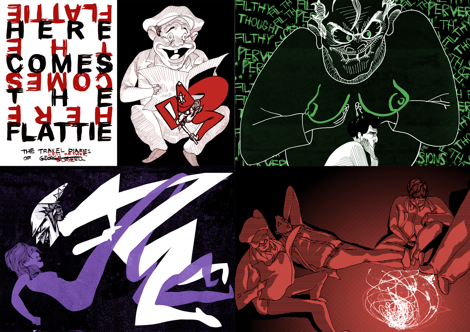
So I got pretty much everything set up, and realised that I forgot a key rule of book making, the page amount needs to be a multiple of four! At the point of attempting to print I had 14 pages, two short. This actually totally works in my favour though, as I regretted not including the actual "here comes the flattie" quote from Orwells diary. Anybody who I've shown the book, or artworks from the book to have always asked where the sentence/ name of the book came from. So I could make a little rough printed version of the book, I created a placeholder page, using some frilly font, not really what I want the final to look like, but it'll do for now.


Last minute colour experimentation

Im pretty comfortable with my colour choice now, but wasn't entirely confident with my colour choice for this image, or to be more specific how the different elements of the image were coloured. I ran this collection by a few of my peers, and it seemed that the images had them torn also. Finally by one point the original colour scheme came out on top. I can feel more confident about this image now, knowing that the colour usage makes for a easily decipherable outcome. I think its about time I get this book printed.
Colours
Its time to play with colour, now that the imagery is finished, I had to see if I could be swayed in to picking a different dominant palette. I didn't really expect this, but i'm un phased by it all, I still feel that pink should be the colour of choice. It could be a case of looking at the artwork for long enough has just engrained that "these colours are the way this book should be"... if that even makes sense. Pink all the way.
Finally polishing off the farmhouse pages
Time to face fears and see how the farmhouse pages look with the addition of text.


And I think I pulled it off, the images aren't a complete jumbled mess. I feel this might be because of the minimal use of text. Using paragraphs would have really fucked it. I forgot to cover in the post my use of colour on the characters for these pages, see the highlighted pink characters correspond with the text, to hopefully portray who is speaking on each page. Having sorted that I need panic no more, and am two pages closer to a finished printable book.
Fearsome Flattie

So glad I remember to do this, just makes the big guy even more intimidating as previously stated, just needed to apply the screen print texture to the pink, like all the other images and i was done with it.
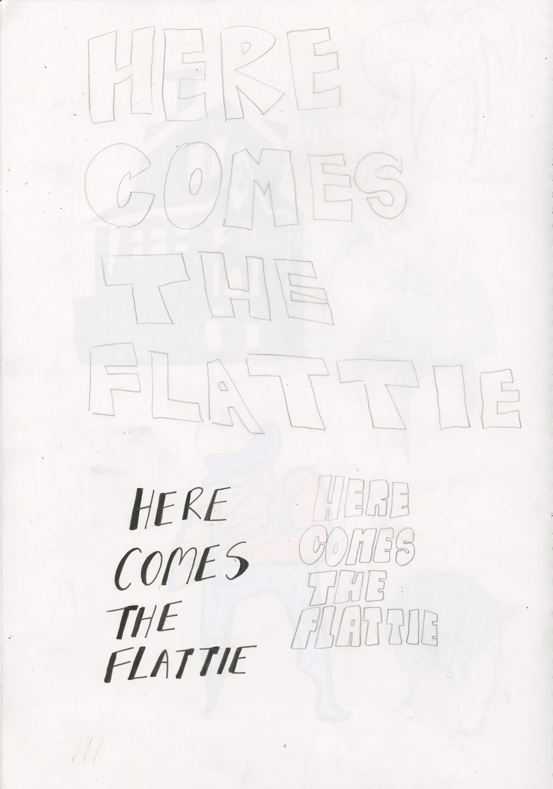
Final font

So I had a accidental breakthrough with type, during a lecture, type was on my mind, and so I started scratching away some rough text. It turned out to be just the ticket, a rough simple approach. I then took the idea to my sketchbook with a fat marker and voila!

I had the idea to then do with the text what I did with that print of the hobo head that I said I shelved way back when. Having a normal layer of text in black, then another layer of the same text, upside down in pink/ whatever colour is decide upon after having some colour experimentation. I feel messing with the text this way makes the cover far more interesting, kind of making you work to read the text, and have that bit more investment in picking up the book to flick through.
Speaking of the shelved idea, I said I'd work on the repeated likes print of the leaning large flattie, think it's tim to do so.
Hand Made type, its a real bugger
Something thats been kind of driving me crazy about previous pages, is the fact that I used an existing type on the first page. Personally, I like to make my own type for my imagery, so, I had to sort that out. Took quite a lot of work to come to a conclusion, check all this out.


All this, and still no conclusion, I have a lot of perfectly useable type work here, but none of it feels right for Here comes the flattie.. I'll find a way to use some of these ideas outside the project at some point.
Conclusions: The back page


I got straight on to drawing the hobo, I had roughed the image up enough during editorial that I knew what I wanted the fella to generally look like. I also knew I wanted the Flattie to be featured, and thought it would be fun to have him popping out from the newspaper. With this I had two versions of the image, one where the Flattie censors the penis with a big exclamation mark sign, and another where he doesn't do that, and the genitals are in full view. The first design as a whole struck me as being better, which was agreed by anybody I showed both images to. I personally feel its a combination of the flatties facial expression being more interesting, and the sign centring the image as a focal point.


I had a mess around with the colour, coming to the conclusion that the dark background would be better, trying to link him with the previous fireplace scene, sat in the darkness. Then an all pink uniform and board was decided upon, it feels like a nice entry point for the eye with the colour, centring on the face of the flattie, which then thanks to the hat and exclamation point, leads up to the hobo's goofy mug. And thats another finished page, almost completed the book.
Orwells Flasher friend to tie things up


Final page, then a cover with the remaining type of the book, thats all thats left. Seen as it's going to be another character based image, Im going to do this one first and leave the cover/ text till last. This final image I want to be a bit of a punchline after the calm fire spread, yet again using a scene covered in the editorial stage of this unit. This is the flashing Hobo! A man that Orwell befriended, seemed quite a smart fella, and then was found on a field flashing behind a newspaper to passers by. So Im going all out on creep factor again, big toothless expectant grin, weird cartoony bulging eyes and goofy, floppy ears.
Saturday, 14 January 2017
Monotype, the saviour


I again ran down and boshed out some fires, different consistencies so I can play with them and find a suitable balance.

The first one came out on top, not being too intense and being too barren. I found that the draught fire line work being left underneath helped to give the flames some energy, like seeing the frames before and after in an animation. Messing with the colour, I really like that the scene was opened up, so how about I use black to have them rendered in darkness, and just the fires glow as a light source. This also contains the scene, the eye knows to circulate the scene within the glow of the flame. Time to address the shading on the characters, now having a set light source.

I tried to re create the hatched line work, like the original, using digital lines, but it was very apparent that they were added afterwards, looking out of place against the original. With that I just filled in the shadows, and applied a line halftone filter. This really worked out, with those sections being dense and darker than i would achieve having hand drawn it. Thanks to this they really come accross as shadows, blending in to the darkness. That draws this image to a close. I don't know how I feel about this one now, It might be the disappointments along the process of making it. I feel like it is a suitable outcome, but just cant really bring myself to like it. Ill sit on this one, see how I feel in a while. Its time to wrap things up with a cover and reverse design.
From the easiest digital section, to the worst
It was a bit of a hassle trying to get this image to feel right.

The characters all fit together nicely, that was fine, except for a lack of consideration on my part as to where the light source was coming from. They all don't match in that sense, but i'm sure I can think of a solution around that. Its the surroundings that were a real pain. I had an Image of a little tin hut, filled with hay for "furniture"/ something to lay on. I had real difficulty with both the ridges on the walls and the hay. I believe you can see what Im going for with the walls, but they're clearly crude. The hay literally looks like a cloud, nothing hay like about it.

I tried out converting an image of hay to halftone, but that really didn't help things.

The hay was scrapped, and a grass brush was introduced, awful, really poor decision on that one. Just looks rough and really out of place, especialy considering the imagery of the rest of the book.

I thought then a splash of colour was the missing element, throw a fire in there, a nice thing for the group to gather round. Didn't really save the image, but seemed like somewhat of a step in the right direction, the fire needed better execution.

Out of frustration with the image, I stripped everything away added a gradient, so i could stick it on Instagram. This helped a lot though, the lack of background totally added to the scene, I want the scene to be relaxed, so having the people all cramped up totally detracts from that feeling. Keeping this and adding a fire seemed to be the way to go.

A quick mock up has me feeling that I may be correct, Im going to make some mono type flames, and Im gonna need to strip down the colours, as this clearly goes over the two colour limit right now.
The last of the double page spreads

It's been a long journey, but the end is in sight, I wanted to end this rollercoaster with a peaceful scene shared by orwell, ginger and a few other homeless fellas. This comes from the final entries of Orwells hop picking diary, when orwell and Ginger finally make it to the hop farm, and are put in a hut with other workers whilst they work on the farm. I started thinking about these pages back when I started the prostitution spread, I knew the positioning of the characters and illustration of the environment would need some consideration, so got on it early.

Feeling like I could actually move on, i finally drew the hobos in their crosshatch way, all separated so that could mess with their scale and position in the next digital stage. I opted again to have rather normal proportions, this is a calm, relaxed scene. No deed for limbs flailing about all over the place.
The simplest digital step yet

So not a great deal of detail to go in to with this one, things just fell in to place. Orwell and Ginger were pretty much already good to go. I cleaned up the bushes, and I do feel they stop the sections separating the characters and the farmer from being dull. The only real issue was the farmer blending with the bushes, regardless of the fact I erased the leaves within his form. For this I changed his line work overlapping with the bush to white. This means he stands out now, but don't quite know wether to keep it like this.
S'more monotype printing


Back to the print room yet again for this spread. When drawing the farmer, I opted to leave the screaming face out of it, considering he will be too small in the frame for them to really be distinguishable, and I feel the raised jaggy arms paired with the rough aesthetic of the medium get the anger accross anyhoo.
I spent a load of time drawing out the bushes only to realise, that yet again I didn't apply enough powder to the ink, leaving an image of blotches. In fairness, i felt the pencil i used gave too thick of a line, so Id probably have re drawn it regardless.

The second attempt turned out much better thankfully, there are some patches that require a digital touch, like clearing out the pathway, but should be simple enough to accomplish.
Next spread, thieving from a farmer
And now its back to the theft image from the editorial
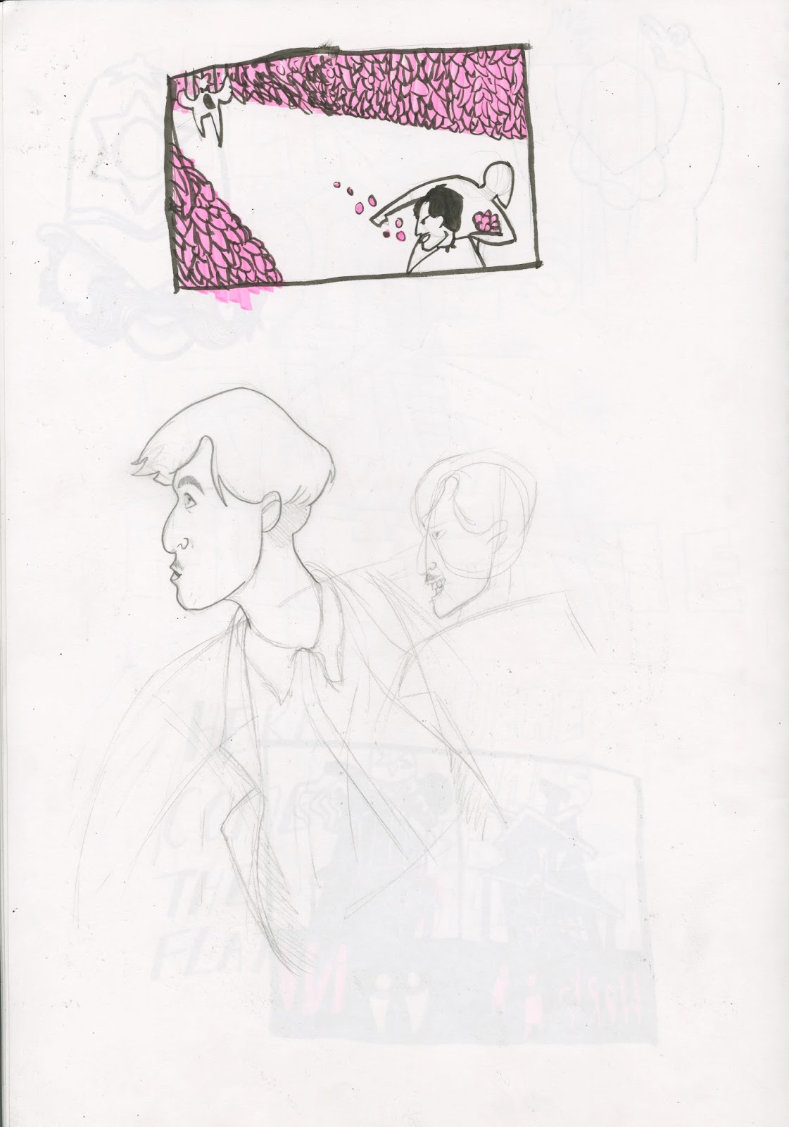

Ive got a pretty simple layout planned for this one, using the design from the editorial draught. The scene will be between two growing bushes, i'm sure that's not the official terminology but it'll do. One side in the distance will feature a shouting, monotype farmer, with Orwell and Ginger running away at the opposite end, arms filled with raspberries. I feel unsure as to wether this will be too barren considering it will stretch accross two pages. I really need monotype to bring some character to this image or I may need to re think it entirely. With that I also felt the need to really give some detail to Orwell and Ginger.

Giving them the hobo hatch work look, having this makes me feel a little surer about the page, the characters are pretty strong as a focal point. I decided that Ginger would be in to stealing, being a thief already. For this I gave him a big grin, looking onward, uncaring about the farmer chasing him, again, he'd be used to this kind of occurrence. Orwell on the other hand does look back, but seems caught up in the excitement, holding back with a slight smirk as he does so. There were multiple entries of these events happening to the two (asking for work, getting rejected, stealing), leading me to believe that they would have probably not be struck with guilt whilst stealing, doing what they had to to get by.
Subscribe to:
Posts (Atom)