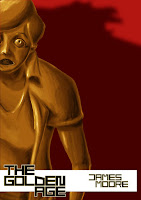
Having the building blocks set up for the cover, I just needed to move the elements around, seeing how they interacted with each other.
My first application of the type just didn't work out for me, and for some reason really wound me up for not working the way I had hoped, the image and the text just clash to me, later occurring to me that dark on dark doesn't really work out. I needn't have worry about putting a shadow over the figure at least, as placing the shadow behind it, leaving it as is, still got the point accross. Because of the irritation from the text, I tried positioning of the character/ statue instead.
At this point, I felt that having the character closer to the viewer looked better and offered a really nice sense of scale with the shadow in the backdrop, again with the addition of type though, this swayed my opinion.
To get around the colour issue, i put a white banner behind the text, with the addition of my name. I feel like this is an improvement on the previous application, the text is easier to take in this way. Outside of that, the text kills these close compositions, really interfering with the flow of the images, regardless of where I placed them.
With this I resized the figure, showing the whole form, and with that we had a winner. Showing this to a group of others also offered a unanimous opinion that this worked out for the better.


No comments:
Post a Comment