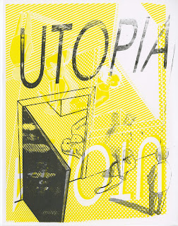
So to ensure we were ready to think compositionally again, the group were tasked to draw the compositional elements of existing artworks, so yeah, this got me all loosey goosey and ready to draw.
So, first things first, i really need to apologise about how sparse my thumb nailing process is to an outside source, i've never really needed much other than the basic elements of an image jotted down to work from, especially when the outcome is digital and i can really get experimentation with shading and the like done in that step. So apologies aside, from my scribbles two really stand out to me, my idea for the white stripes track "Finding it harder to be a gentleman", and a scene using characters from the channel four drama UTOPIA. The white stripes character would feature the two band members in a wood, high angle shot with the tree stumps centralising the image. As for the band Jack would be dropping meg in to the mud, because of the lyrics:
I'd never said I wouldn't
throw my jacket in the mud for you
but my father gave it to me so
maybe I should carry you
then you said
You almost dropped me
so then I did
...
and I got mud on my shoes
As for the utopia image, it would also feature two characters from the show, but in a scene that isn't. They're both contract killers and do their job non challauntly, so i thought of a scene thats, another high angle shot, of the two stood outside having a smoke and a chat, whilst you can see a brutally murdered corpse through a doorway. This one sounds more visually engaging and challenging to a viewer because of its dark themes, so it sounded perfect to me.
I started by simply mapping out shapes, much like i did in the thumbnail.
And refined the line work a little and had a bit of a play with where the shadow would fall, thinking of block colours and possible overlay sections.
Returning to the image, i cleaned up the line work, sorting some of the awful scaling, like the character stood on the bags head, and again tried some colour combination, lovely shades that work really nicely with the image as it is, but might not work when i beef the image up with some halftones.
I mean, it still looks nice, but the tones might need to clash more, i feel like the character with the bag will be especially hard to make out from a distance.
A much easier to read image, but is taking the brightness away from the yellow tones that are synonymous with the show, nah.
Nice colours but i'm completely straying from the yellow palette, i thought it was worth a try, but it just aint utopia.
This is the one for sure, block yellow and black! Sadly this means i'm going to have to sacrifice any element of overlaying colour, but i cant argue with the image, its exactly what i was looking for. Before moving on, now that i have an image that i'm happy with, i feel its time to talk about my compositional elements.
These will be each of the layers for the screen, left for yellow, right for black, so excited.
So here they are, final outcomes! I must say, overjoyed, the first print is an untouched original, the others shouldn't really exist, but i just couldn't help but to experiment further and see wether or not they would look with painted blood. If i'm being honest, it was a bit of a silly mistake, because it totally kills the compositional value of the image. I feel like the original is well balanced, with the pointers guiding the eye through the images entirety, whereas the bold red jumps out, becomes the centre of attention and renders the other pointers somewhat redundant. The black isn't nearly as bad for this and i consider it a suitable alternative.
Heres one that i buggered up by printing the black upside down, and i actually really like it as an outcome, the text sits nicely atop the diagonal halftone lines.
And here they are all together, i got a nice amount made, cant wait to start trading for some of the wonderful outcomes of my peers.


No comments:
Post a Comment