
I for sure had a rough looking type in mind, going back to the idea of the final outcome looking grungy. I remembered a method raised during my print induction called monotype, Im sure I tried it back in college to no success, but now i know that it is what my project needs.

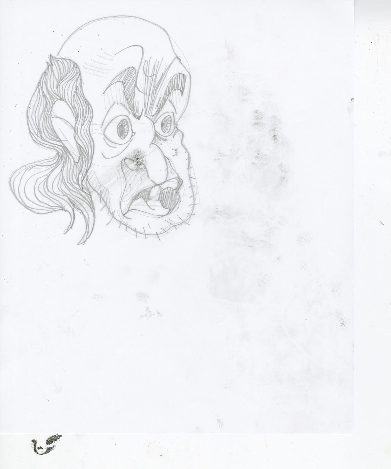
I started with a rough sketch of the first hobo face, this is both sides of the paper to illustrate how the process works. Ink is rolled out on to a worktop, which then has powder lightly spread atop it. The paper is then put on to this, you draw on the paper with whatever you choose, and voila, a rough, blotchy, mirrored version of what you have drawn. A nightmare for perfectionists, but perfect for what I need.


I played around with a stretched out copper, something that will be happening in a later page of the book. Nothing seemed to be going wrong, leading me to feel that I could move on to making the type.

Then when playing with some character designy stuff, I raised the sheet to realise that the ink hadn't quite been given the right amount of powder. I think it kinda works in this roughs favour, but couldn't be further from what I want with the text to be. It would render the text illegible, so I had to be sure to get the right powder ratio.

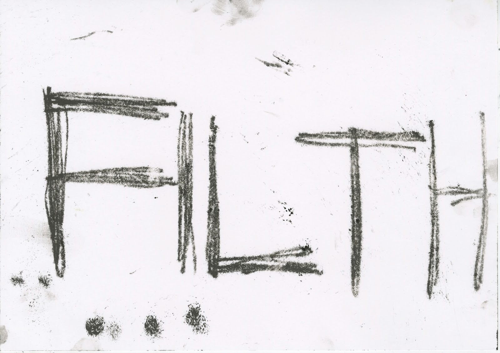

Thanks to that little life lesson, things went pretty well with the text. I decided to go for a rough quickly written look for the text, to resemble something of a passing thought, the text being a snapshot in to the hobo's mind. I also opted to make the text black, because this makes the line work easier to isolate at the digital stage, I will pretty much be doing this for the majority of my textural creations.
No comments:
Post a Comment