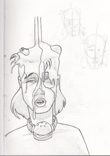
Being so Young’s first competition, they seem to have left a few details out of the brief, the scale and orientation of the work. They recently shared a submission, showing what they wanted A single A4 page, portrait orientation. This has influenced the direction I feel the outcome should take. The band consists of five members, so cramming that amount of people in a restaurant scene within a page wouldn’t work. I’ve opted to focus on the singer, a portrait that encapsulates the fast food theme. Here’s a list of the things that strike me about him, his “look” to use within the image:
-A striking, colourful mullet
-Mesh clothing
-Ball gags
- Messy, running makeup from performing
-Sexualised themes
This is something they hopefully rectify in future competitions. But it has served as a lesson to research projects thoroughly before starting them, and if necessary info isn't found, ASK!


No comments:
Post a Comment