I was quite worried about finding a link for architectural work, but i got incredibly lucky and found the perfect website for what i needed, showcasing a wide breadth of work, all looking slick and all containing nuggets of information on the process, idea or project behind the work. This haven that somehow made buildings interesting is called Visualising Architecture.
Just look at the gallery page, the different approaches, the different lovely colours.
This is the first thing to catch my eye in the sea of goodness, its actually a tutorial on how to make this effect, by a fella called Alex Hogrefe, obviously i wont be able to try it out, having to use vectors, and i have already used blueprint to show an architectural space for a previous project, so i think ill let this one pass for now. What i will take away from it is that even though some of the dimension is lost by only using two rones, there is enough information for me to make out the building, i shouldn't be afraid to make things really basic if needs must.
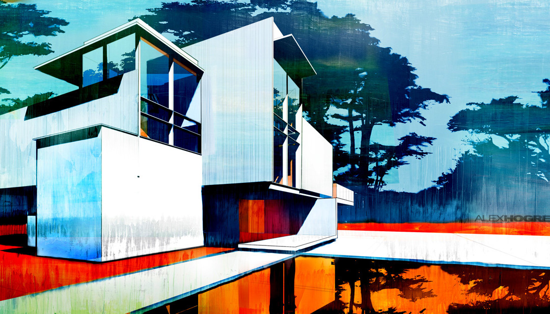
These colours are really tasty, really really tasty, i absolutely know that i want colour to be a main concern in my imagery after seeing this. It is created by the same person as the blueprints, and its simply his display of having to create a more abstract form in his work, similar to my project.
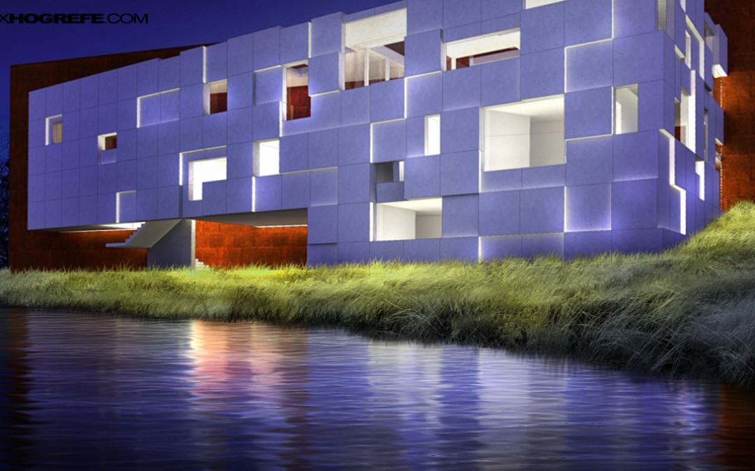
This one combines all that was good about the previous two images, great colours and really simple design, nice stuff, i think this will be my main inspiration, lets see how this plays out.
I also have this architecture book from Grenwich uni that pretty much confirms that i should concentrate on colour to make my images interesting.


No comments:
Post a Comment